Types of Logos: 7 Types and the Files Each One Needs
There are seven main types of logos: wordmarks, lettermarks, pictorial marks, abstract marks, mascots, combination marks, and emblems. Most brands pick one as their primary logo and pull the others out of it for small spaces. This guide shows each type with examples, when it fits a client, and the part most guides skip: which variations and files each type needs when you hand it over.
Key takeaways
- The seven types fall into three groups: text-only (wordmark, lettermark), symbol-only (pictorial, abstract, mascot), and text plus symbol (combination mark, emblem).
- A logomark is a symbol with no words. A logotype is the name set in type. A combination mark puts the two together.
- The type you choose decides how many variations the client needs. A wordmark can get by with three or four. A combination mark usually needs six or more.
- Across the 537 logos uploaded to Sinqlo, designers end up with about 5.6 variations per logo. In four formats, that’s roughly 22 files for one logo.
The 7 types of logos at a glance
| Type | What it is | Famous examples | Best for |
|---|---|---|---|
| Wordmark (logotype) | The brand name in a distinctive typeface | Google, Coca-Cola, FedEx | Short, memorable names |
| Lettermark (monogram) | Initials only | IBM, HBO, NASA | Long names people already shorten |
| Pictorial mark | A recognizable image | Apple, Shell, the old Twitter bird | Brands with a name you can draw |
| Abstract mark | A non-literal shape | Nike, Pepsi, Mastercard | Brands that want to own an idea, not an object |
| Mascot | An illustrated character | KFC’s Colonel, Mailchimp’s Freddie | Friendly, family or community brands |
| Combination mark | Symbol and name together | Burger King, Lacoste, Doritos | Most new brands |
| Emblem | Name set inside a badge or crest | Starbucks, Harley-Davidson, Ferrari | Heritage, schools, auto, craft |
1. Wordmarks (logotypes)
A wordmark is the brand name, and nothing else, set in a specific typeface or custom lettering. “Logotype” means the same thing.
Google, Coca-Cola, and FedEx are the classic examples. The whole logo rests on typography, so the work goes into the letterforms. Off-the-shelf fonts rarely feel ownable without some redrawing: tighter spacing, a custom ligature, a cut in one letter. FedEx’s hidden arrow between the E and the x is the most famous version of that.
Pick a wordmark when the name is short and distinctive. It fails when the name is long, because the logo gets unreadable at small sizes.
2. Lettermarks (monograms)
A lettermark shrinks the name to its initials. IBM, HBO, and NASA all have names nobody says in full, so the logo uses the version people already say. IBM’s striped letters, designed by Paul Rand, are still the textbook case.
It’s the fix for long names. The catch: initials alone mean nothing to someone who’s never heard of the brand. A new company with a lettermark usually needs the full name close by in its early years, on the website header, the business card, the packaging.
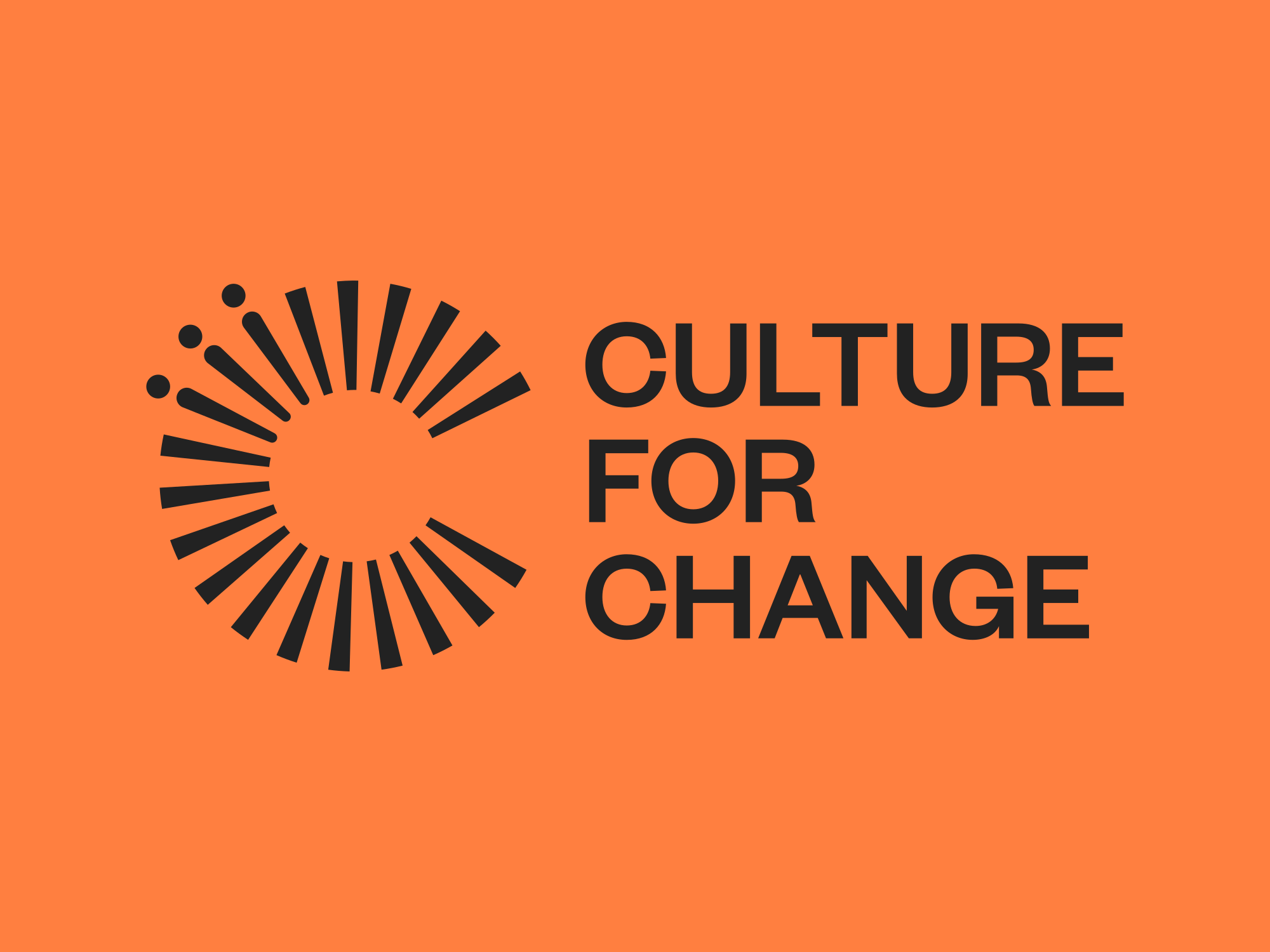
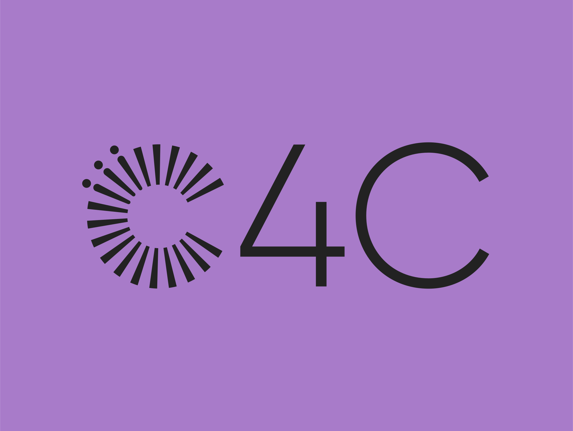
Culture for Change, another of our clients, does exactly that: the full name for the website and print, and a short C4C lettermark for avatars and tight spaces.
3. Pictorial marks
A pictorial mark is a recognizable image that stands for the brand: Apple’s apple, Shell’s shell, Twitter’s bird.
This is what most people mean by a logomark: a symbol with no words. Pictorial marks are memorable, but they’re a bet. A brand-new company with only an icon is asking people to learn what the icon means. Most of the famous ones started life next to the name and dropped it once the symbol had done its job.
4. Abstract marks
An abstract mark is also a logomark, but it doesn’t depict anything real. It’s a shape built to carry a feeling. The Nike Swoosh suggests motion. Pepsi’s circle and Mastercard’s overlapping circles don’t depict anything at all.
Abstract marks give a brand something nobody else owns, and they work across languages because there’s no word to translate. The risk is the same as pictorial marks, only bigger: the meaning has to be built by the brand over time, not read off the shape.
5. Mascots
A mascot logo is an illustrated character: Colonel Sanders for KFC, Freddie the chimp for Mailchimp, the Michelin Man.
Mascots make a brand feel approachable, and they’re useful far beyond the logo, in ads, packaging, and stickers. They’re also the hardest type to scale down. A detailed character turns to mush at favicon size, which is why most mascot brands keep a simplified head or a wordmark for small uses.
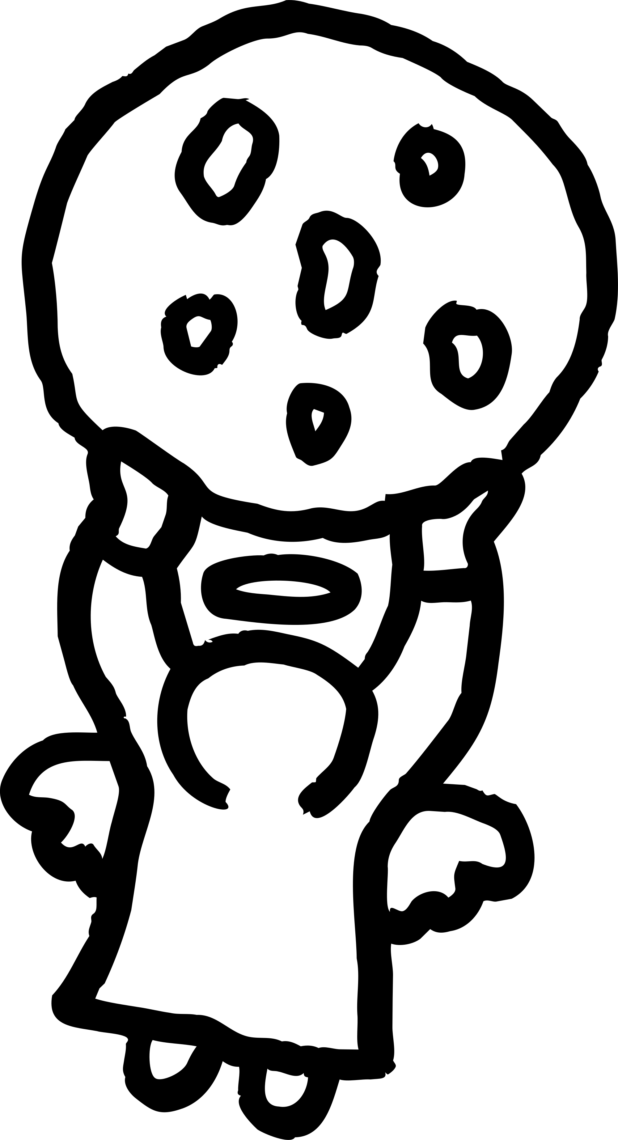
Holy Crumb, one of our studio’s clients, does exactly that: a hand-drawn angel for packaging and social, and a heavy stacked wordmark for everything small.
6. Combination marks
A combination mark pairs a symbol (pictorial, abstract, or mascot) with a wordmark or lettermark. Burger King, Lacoste, and Doritos all use one.
It’s a common choice for new brands because the name teaches people what the symbol means, and later the symbol can stand alone.
The way the symbol and the name are arranged is called a lockup. Most combination marks need at least two: a horizontal lockup for website headers and email signatures, and a stacked lockup for square spaces like social posts and signage. Then the symbol and the wordmark each need to work on their own. That’s four logos from one design before you’ve even touched color.
7. Emblems
An emblem puts the name inside a shape: a badge, seal, or crest. Starbucks, Harley-Davidson, and Ferrari’s shield are examples, and so is nearly every university and sports team.
Emblems feel traditional and authoritative. Their weak spot is detail. A crest that looks great on a storefront can fall apart at 32 pixels. The usual fix is a responsive logo: a simplified version of the emblem, or just the inner symbol, drawn for small sizes.
How to choose the right logo type for a client
Three questions settle it most of the time:
- How long is the name? Short and distinctive points to a wordmark. Long points to a lettermark or a combination mark.
- Does anyone know the brand yet? A new brand needs its name in the logo. Symbol-only logos are for brands people already recognize.
- Where will the logo live at its smallest? If the answer is an app icon or a social avatar, you need a symbol that works alone, which means a combination mark, an abstract mark, or a pictorial mark.
What each logo type needs in its brand kit
The logo type decides how much you hand over at the end of the project.
| Logo type | Variations a client usually needs |
|---|---|
| Wordmark | Primary, inverse (white), one-color black |
| Lettermark | Primary, inverse, one-color, plus a full-name version for early use |
| Pictorial / abstract mark | Symbol in full color, inverse, one-color, plus a version with the name for new audiences |
| Mascot | Full illustration, simplified head for small sizes, inverse, one-color |
| Combination mark | Horizontal lockup, stacked lockup, symbol alone, wordmark alone, each in full color and inverse |
| Emblem | Full emblem, simplified responsive version, inverse, one-color |
A real example: Dragon Clean
Dragon Clean, one of our studio’s clients, shows how far one combination mark stretches. The brand kit has the primary logo, a horizontal lockup, a stacked lockup, the symbol on its own and the wordmark, and each one comes in full color, white, black and monochrome.

Every one of those variations then needs to exist as SVG for the web, PNG with a transparent background for slides and email, PDF for print, and ideally WebP for fast web pages. If the formats are where you get stuck, see SVG vs PNG: when to use each format.
Sinqlo’s own numbers show the scale. Across the 537 logos designers have uploaded so far, the AI Assistant has generated 3,002 variations, about 5.6 per logo. In four formats, that’s roughly 22 files for every logo a studio delivers.
Why the logo type matters at handoff
Twenty-two files is where the old workflow starts to hurt:
Export every variation in every format. Rename them so the client can tell them apart. Zip them. Upload to Drive. Send the link. The client asks for the white version. You resend it. The logo gets a revision. Do it all again.
Combination marks hurt most, since they have the most variations to export and keep in sync.
With Sinqlo you stop sending files. You upload the logo once and the AI Assistant builds the variations. Every format gets exported automatically. The client gets a Brand Link: one permanent URL that opens a page with every variation in every format, plus the brand colors and fonts. When you revise the logo, the link updates itself, so nobody has to resend anything. Here’s a live brand kit for HealthyMe, one of our clients, exactly as their team sees it.
That page is what a brand kit looks like when it’s delivered properly: the toolbox the client’s whole team uses, without asking you.
FAQ
What are the 7 types of logos?
Wordmarks (logotypes), lettermarks (monograms), pictorial marks, abstract marks, mascots, combination marks, and emblems.
What is the difference between a logomark and a logotype?
A logotype, or wordmark, is the brand name set in a specific typeface or custom lettering. A logomark is a symbol with no words, like a pictorial or abstract mark. Many brands pair the two in a combination mark.
Which type of logo is best?
No single type is best. Wordmarks suit short, distinctive names. Lettermarks suit long names. Combination marks are the most flexible choice for a new brand, because the name teaches people what the symbol means.
Can a brand use more than one type of logo?
Yes, and most do. A brand usually has one primary logo, often a combination mark, and pulls the symbol and the wordmark out of it as separate variations for small spaces like favicons and social avatars.
Hand over every variation as one link
Whatever type of logo you design, your client should get every variation in every format without opening a ZIP file. See what a Brand Link looks like, or start free with up to 3 brand kits.